Molting

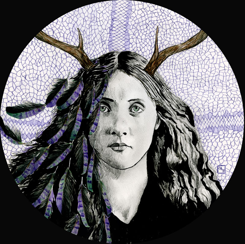
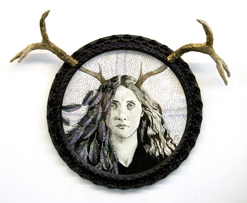
I’m digging back into the archives to finally post this piece that was created for the Nook Collective Holiday Show. The criteria was only that the piece had to be circular, everything else was up to the artist. My piece reflects on the metamorphosis idea often found in Celtic mythology, where one will “shed one’s skin”, hence the title Molting.

Ink, watercolour & coloured pencil, 11″ diameter. Antique frame with antlers made of Sculpey and painted in acrylics.
molting1_web molting2_web

Wayside

Feelings of isolation

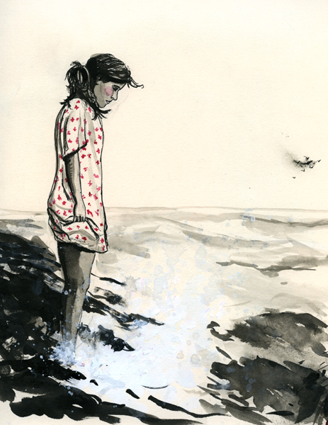
Since moving back to Sudbury, whatever personal work I have been doing has involved a LOT of black ink. Metaphor?

A big empathetic thank you to all the teachers who have had to put up with me over the years. While in post-secondary education I was a much better student, I know in high school I must have been hard to handle. I just finished teaching a first year, semester-long drawing class at a local college and I can now say to you poor teachers: I know how you feel!

Naively, I expected them all to fall over themselves trying to glean some nuggets of wisdom from my experiences as an artist…but whatever I said or taught was mostly greeted with glazed over, indifferent eyeballs. I hope at least a few of them gained a better appreciation of drawing.

Save the Sudbury Watertowers Art Show

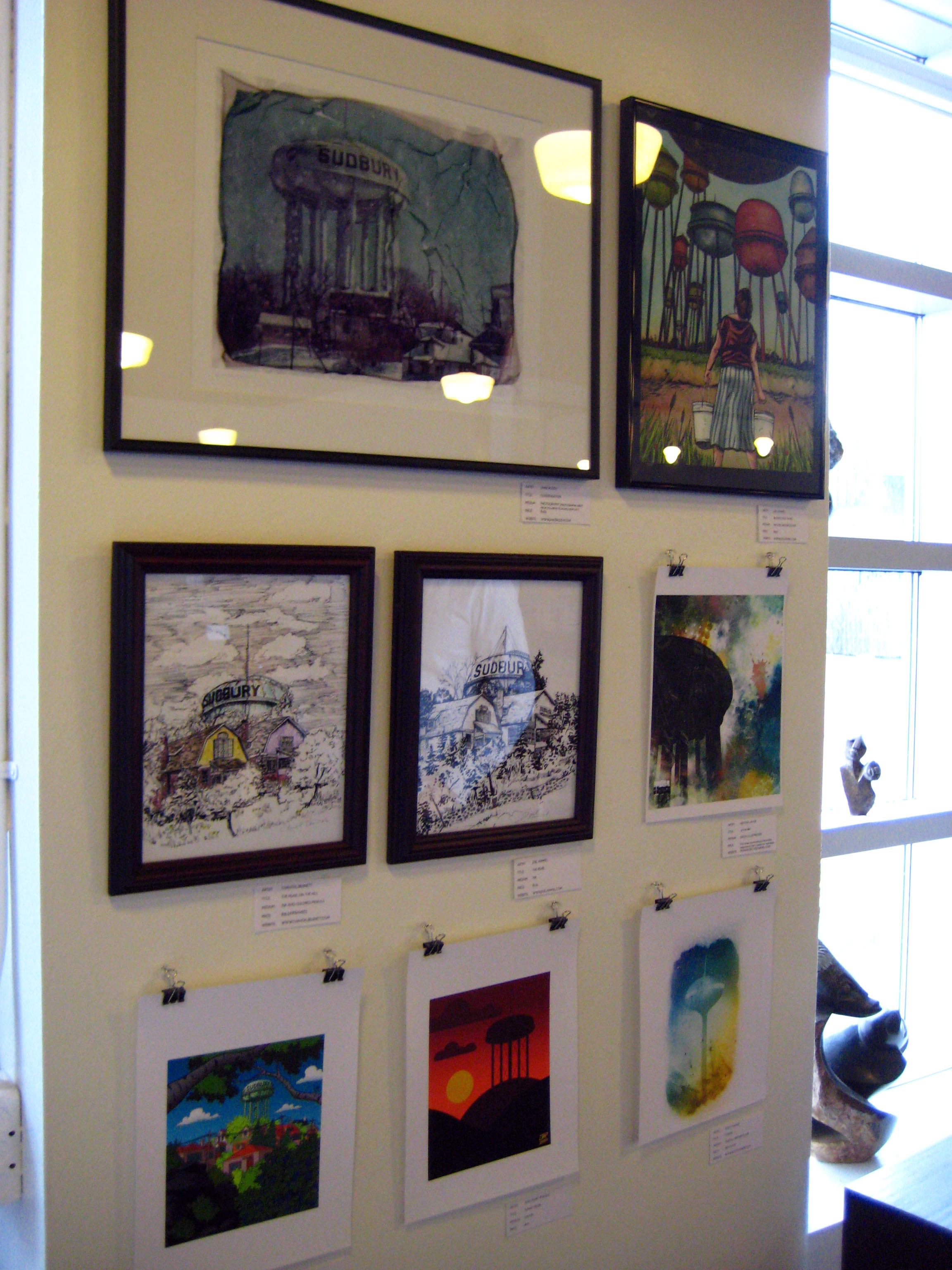
Joel and I (but mostly Joel) organized an art show at the local Fromagerie to save the Sudbury watertowers, which were slated for demolition…but now are saved!

We don’t expect anyone to give Joel credit for pretty much raising awareness in a city that doesn’t give a sh*t about most things cultural, but I want to put it on record that Joel is basically the reason these watertowers  were saved, by keeping the issue in the local media.

Just goes to show, blogs go a long way in small places. Read more about it at his Save the Sudbury Watertowers blog.

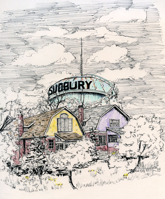
My watertower sketch (which I drew plein air about a year ago) went up in the show beside Joel’s. We were sitting in the same spot, so the sketches are pretty similar, the only difference being that mine has a bit of colour in it.


Joel and my save-the-date

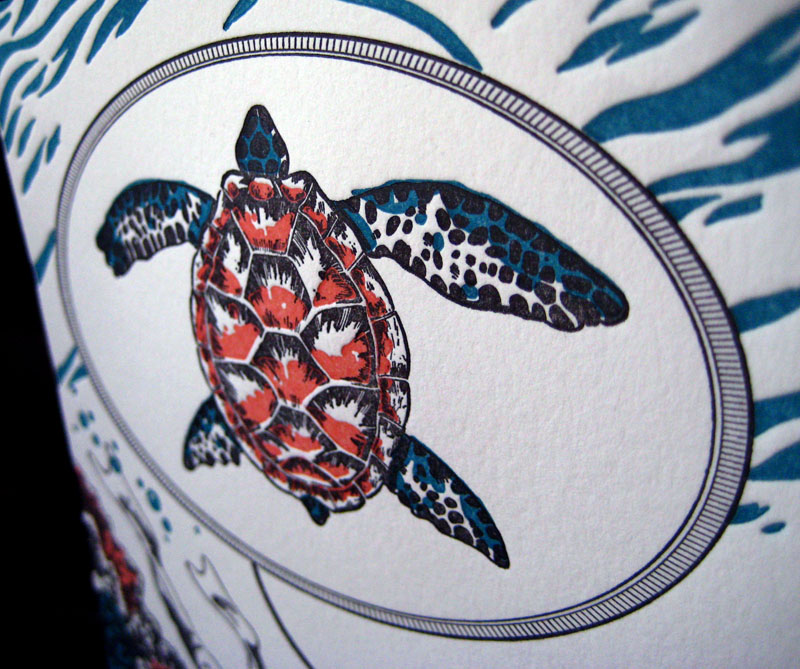
Joel illustrated our letterpress save-the-date to match his proposal book so the theme was red coral (like my ring), diving bells and turtles. And since we are great believers in killing two birds with one stone, he also used the graphic as a promo for his illustration.

 Three colours printed by moi on Crane Lettra, 140 lbs pearl white. 5×7.

The turtle shell even took on a concave shape during printing!

x-posted from Papillon Press’ blog

New year, new website

Nearly every year I re-do my website, and this is the best one yet! I’ve really scaled things down since the last one, which makes it so much easier to upload new content. I’ve scaled back on the illustration side as well; this year I will be concentrating mostly on drawing than painting.  I’m usually pretty terrible at blogging, but this year one of my resolutions is to keep this blog (and my Papillon Press blog) updated regularly.

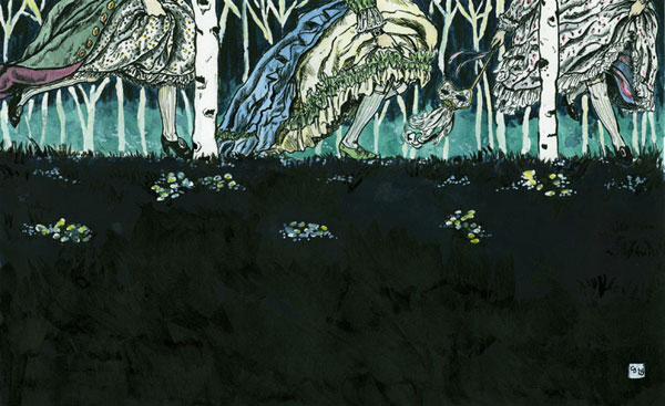
First piece of the new year is entitled Midnight Run.